Newcomers Access Center, Website
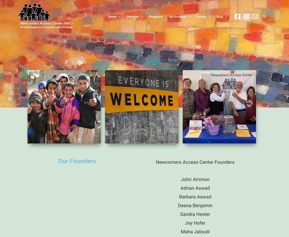
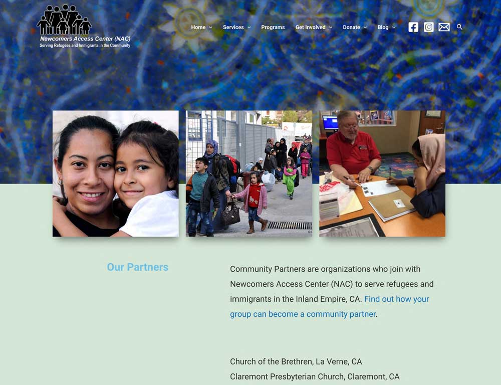
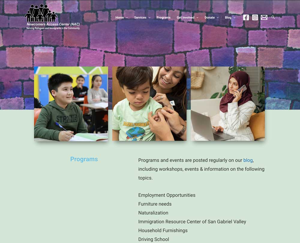
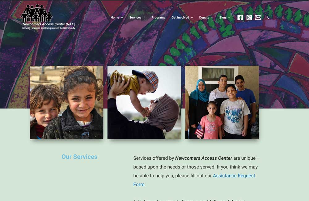
Images speak louder than words: they grab attention and entice you into reading text. A lack of images was why Newcomers Access Center needed a complete makeover of its website. The nonprofit had useful information about its services helping refugees and immigrants, but without images, viewers had to work hard to conceptualize the impact of its work.
Finding good images can be a challenge for nonprofits. In some cases (as in this one) showing images of people who benefit from services can be problematic for cultural, security, or privacy reasons. And turning to stock images can be hard as well because nonprofits want to spend limited dollars on their mission, not on professional stock images.
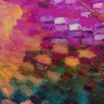
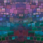
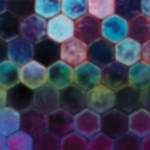
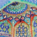
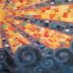
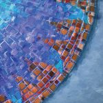
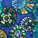
My solution for the NAC website was to come up with a theme that allowed me to integrate the limited photos they had of real clients along with stock photos from a number of free stock sites and to tie it all together with my own art. The theme I chose was mosaics because of the beauty that arises when many different pieces come together. In addition, mosaics are often found in the Middle East, where many of the refugees are from. The rich colors give the site a positive feel. Using art with a hand-painted look, rather than just stock images of mosaic tile, shows the humanistic mission of the nonprofit, and allowed me to blur the background images so they do not compete with the three smaller photos on top. The gallery shows some of the art I made to use.
