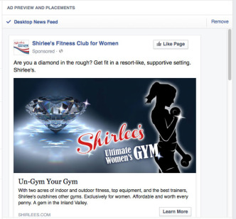
Shirlee’s, Facebook Ad
What sets Shirlee’s apart from its competition is that the gym is clean, classy, and exclusively for women. The gym’s owner wanted …

What sets Shirlee’s apart from its competition is that the gym is clean, classy, and exclusively for women. The gym’s owner wanted …

When the brochure I designed for the College of Osteopathic Medicine of the Pacific won first place in a contest sponsored by …
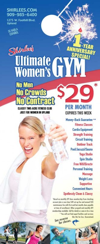
Upbeat, active and fun is the image we wanted to portray on the one-year anniversary promotion of this women’s gym. I chose …
When I designed the logo for this new women’s gym, I wanted it to look strong and feminine. I chose typestyles and …
Wavy text gives this logo for a water district’s anniversary the look of H2O. I choose a flowy, elegant serif font for …
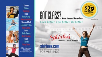
This direct mail postcard promoted the grand opening of a new gym, Shirlee’s Fitness Club for Women in Upland, CA. We wanted …
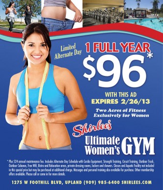
One look gives you the flavor of this business. When I designed the logo for this new women’s gym, I wanted it …
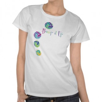
When my daughter played volleyball, I designed t-shirts for her. I also put them up for sale on my Zazzle and Cafepress …