Community Senior Services, 40th logo
Some of the strongest logos just use carefully chosen and placed text. I picked a bold, clean type and kerned the numbers …

Some of the strongest logos just use carefully chosen and placed text. I picked a bold, clean type and kerned the numbers …

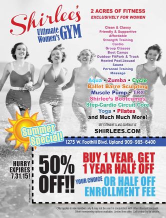
An angled line helps to create movement as well as divide the space into distinct areas: the class list; the coupon; and …

The ages of the women who work out at Shirlee’s gym runs from 14 to older than 80! The largest age group …

We featured two specials on this Shirlee’s ad: “two months free” and “student summer pass.” To make them stand out from each …

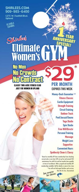
Upbeat, active and fun is the image we wanted to portray on the one-year anniversary promotion of this women’s gym. I chose …

Wavy text gives this logo for a water district’s anniversary the look of H2O. I choose a flowy, elegant serif font for …

The queen of consumption, Marie Antoinette, epitomizes the few who are indifferent to the many—who better to represent the Occupy movement? I …

This direct mail postcard promoted the grand opening of a new gym, Shirlee’s Fitness Club for Women in Upland, CA. We wanted …