Woman’s Club Centennial Poster Series

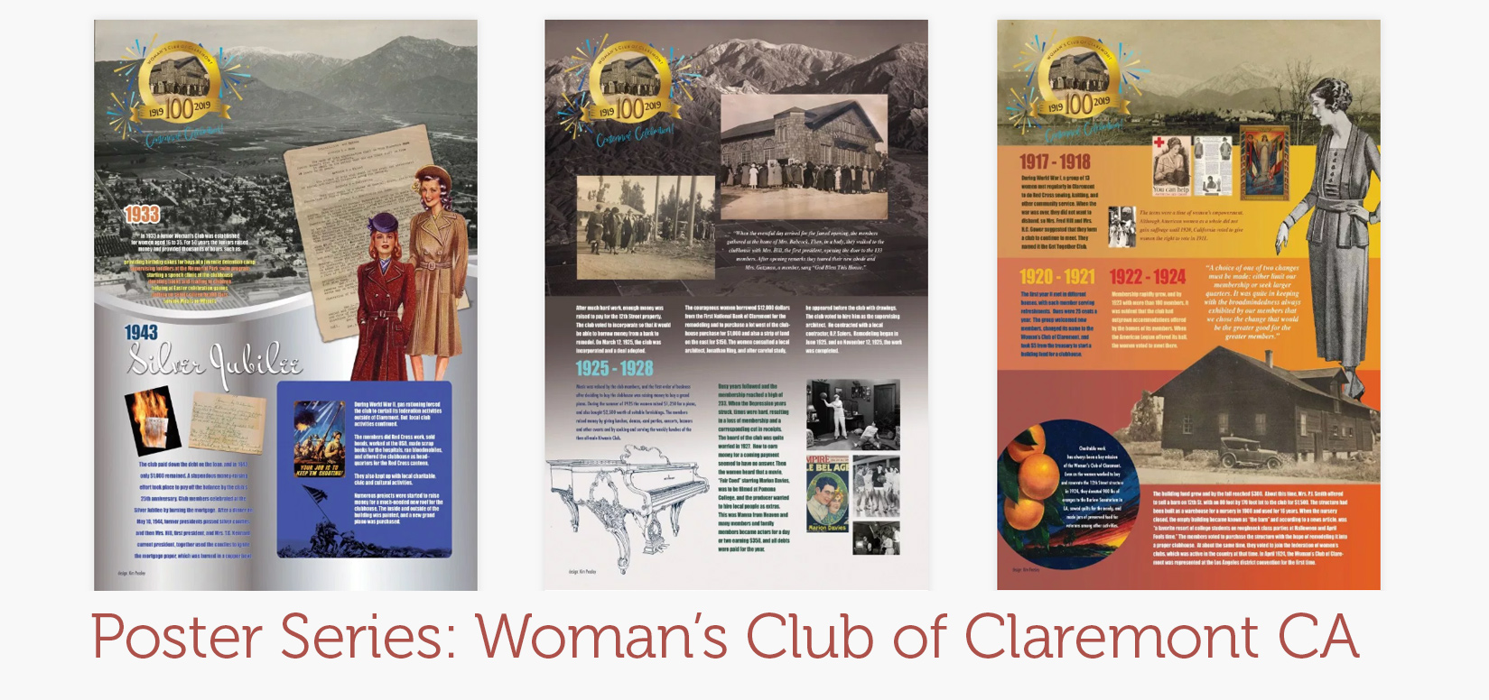
When asked to design posters for the Centennial of the Woman’s Club of Claremont, I looked 100 years worth of notes, diaries, faded newspaper clippings and other emphemera. I did not find a goldmine of great photos, but I did find great stories. So I decided the posters would combine images with text detailing facts and anecdotes about the club throughout the decades. The first poster describes the club’s humble beginnings—13 women meeting in their homes after World War I. But these women had moxie; they dreamed of owning growing the club and owning their own clubhouse. I divided the poster into segments of color with a nod to our citrus industry heritage and added a vintage citrus label. I searched for and found photos of our mountains from the late 1920s. Because the women left few photos of themselves, I used an illustration from a 1925 Sears Catalogue to indicate the fashion of the time. The main focal point is a photo of the building the women bought before it was renovated. This poster was part of a series. Celebrating 100 years is a big event for a small organization like the Woman’s Club of Claremont, and the poster series commemorates that spirit.

The second poster in the series shows the women as they tour their newly purchased and remodeled clubhouse. The mountain in the background reflect how they looked at the time. An anecdote from the archives told how the women almost lost the clubhouse during the Depression because they could not make a payment. They were saved by playing extras at a movie being filmed at Pomona College. Each text box is distinct and readable.

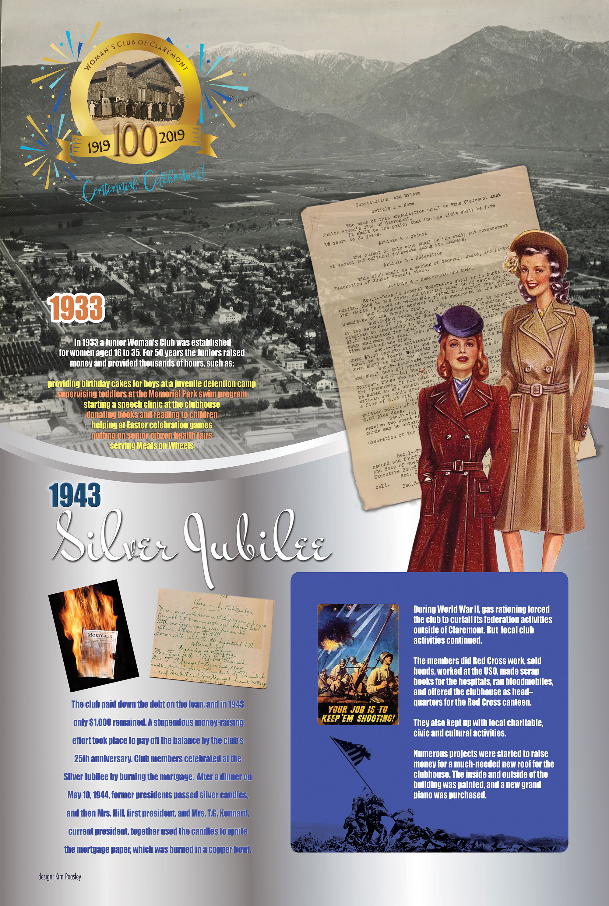
The third poster in the Centennial series shows the 1930s and 1940s when the club experienced tremendous growth and started a junior’s club. The women wanted to pay off the loan on the clubhouse by its 25th anniversary and after a tremendous effort this was accomplished. I used an image of a mortgage burning to show how they burned the mortgage. An inset shows how they helped out the war effort. The background again shows the changing landscape of our mountains as well as a silver gradation.

