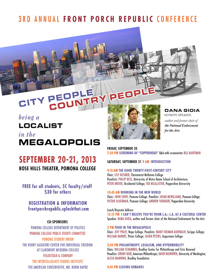
Pomona College, Front Porch Politics Poster
The contrast of two images conveys the message of this event: how to be neighborly in a big modern city. I chose a cityscape of LA and a strong porch image, then created tension by tilting and overlapping them. Academic conferences often have multiple participants. Including names of all the panels and panelists can be difficult however, because too much type means the eye will not register any of it. To avoid this trap, I used different colors to make key words pop. All the information is there, but nothing gets lost. The biggest selling point of this conference was the keynote speaker, so a photo of him along with his title is included. I always make the date stand out so that people see it at a glance.

