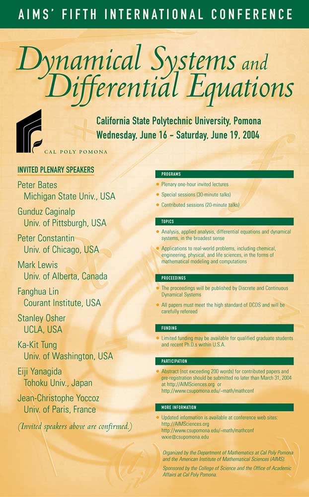
Dept. of Mathematics, Cal Poly Pomona, Poster
Even an text-heavy poster on “Dynamical Systems and Differential Equations” can be spiced up a bit with a design element. Let’s face facts, this conference with top mathematicians from around the world is aimed at a narrow audience. We can’t get too sexy here. And it is only a two-color job. Strong organization and bullets make the text easy to read. In the background I Photoshopped some math symbols into a design and screened it back. The math people loved it.

