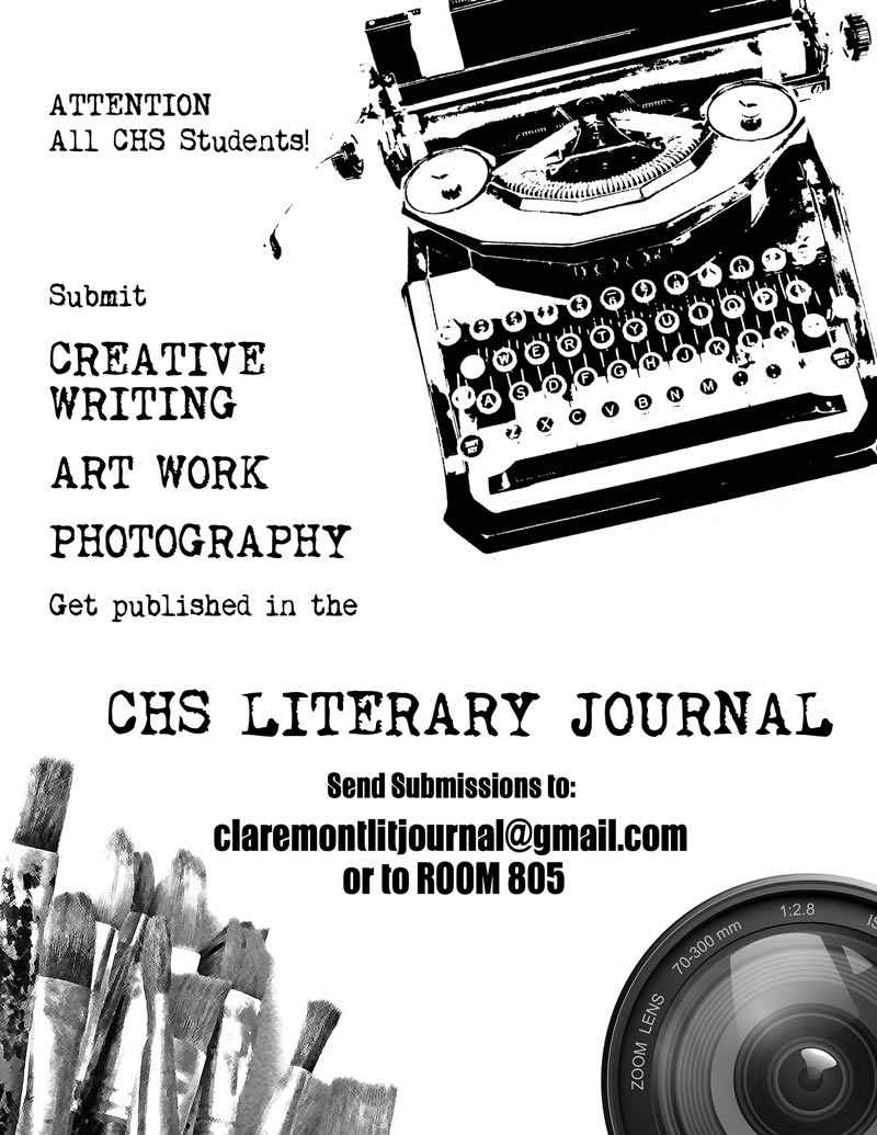
CHS, Literary Magazine Poster
Show, don’t tell: Three words that describe great writing as well as great design. I wanted to show that CHS Lit Mag was looking for writers, artists, and photographers. So I looked for images to represent these ideas. For writing, I found a photo of an old typewriter. To make it look posterized and grungy, I ran it through filters in Photoshop. I took a photo of paintbrushes and ran it through different filters. The zoom lens I left sharp to contrast and represent modern digital photography. Having each element hang off the page strengthens the design. I chose an old typewriter font as well as a modern bold san serif. The constraints of this design—that it had to be made on a copier in one color and seen quickly by students walking on campus—ended up making it more powerful for its simplicity.

