Shirlee’s Ultimate Women’s Gym, Logo
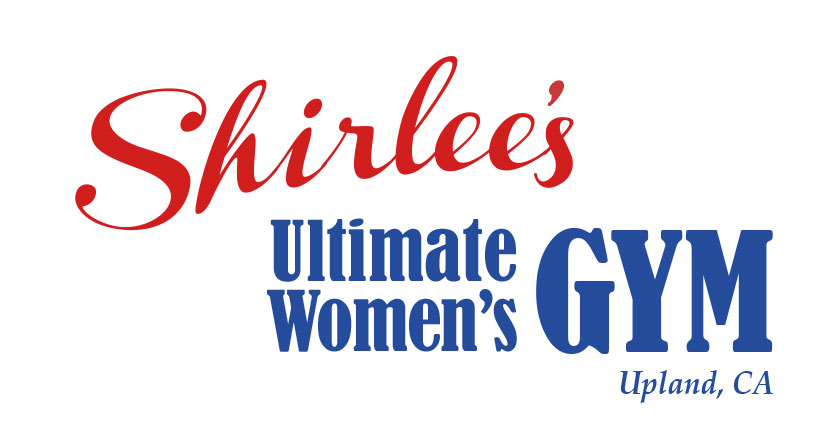
When I designed the logo for this new women’s gym, I wanted it to look strong and feminine. I chose typestyles and colors that do both. “Shirlee’s” type has a retro feel and evokes a signature. I warped it a bit to give it an organic curve. “GYM” is larger so that whether you are reading an ad or a sign from the road you know right away that Shirlee’s is a gym (not a diner or anything else!) The type is strong, yet serif edges give it a feminine and classy touch. The red, white and blue colors are sporty and American. I purposefully avoided pink altogether.
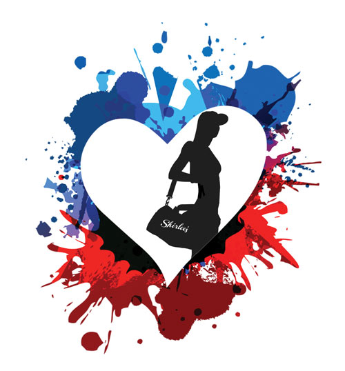
I also designed a secondary design element that can be used with the text logo: a heart with a silhouette of a woman going to the gym with paint splatters in the background.