Aase Fund Logo
Logo I designed for the Aase Fund using a gavel for the cross in the A.

Logo I designed for the Aase Fund using a gavel for the cross in the A.
Jazz is both freeform and disciplined. To create a logo for the jazz combo Full Circle, we used a circle to center …
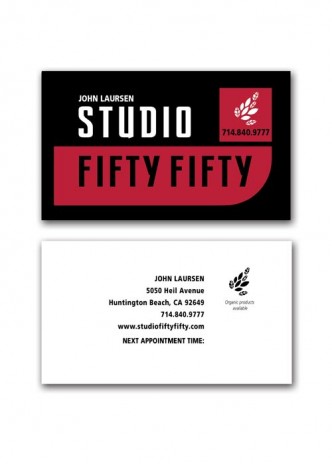
A bold modern look was what the client wanted for his business card. I love this clean typeface. The front of the …
A pink bra with a ribbon in the center represents pink breast cancer awareness and women’s health. Interesting type manipulated in Photoshop sets …
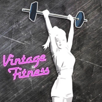
Using a retro pinup look, this logo features a woodcut style silhouette of a strong woman holding a barbell. I designed her to …
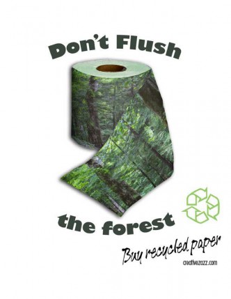
It’s bad enough that we cut down old-growth forests for timber, but for toilet paper? Why? Turns out the fibers from centuries-old …
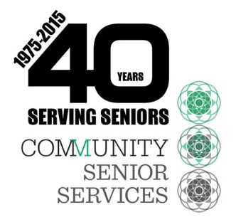
Some of the strongest logos just use carefully chosen and placed text. I picked a bold, clean type and kerned the numbers …
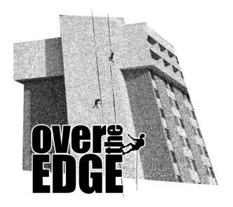
Over the Edge puts on fundraising events for nonprofits by organizing events where donors rappel off tall buildings. When Community Senior Services …
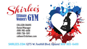
Paint splatters behind a heart give a vibrant feel to this business card for Shirlee’s. The silhouette of a woman on the …
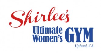
When I designed the logo for this new women’s gym, I wanted it to look strong and feminine. I chose typestyles and …