After School and Beyond, Brochure
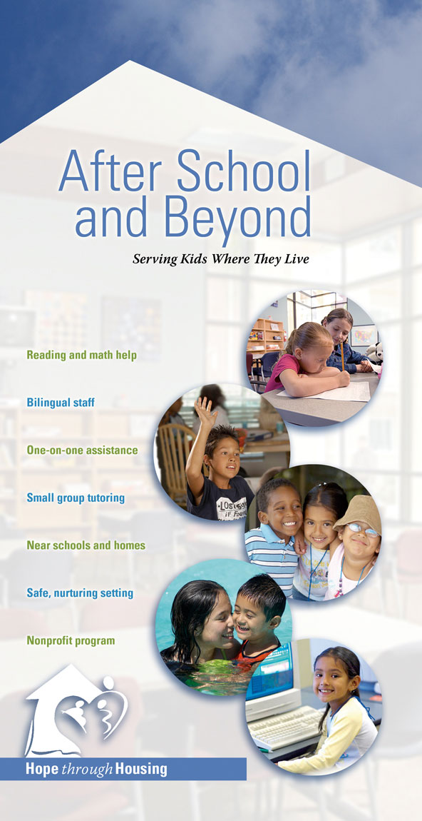
Even non-profits need to market, especially if they compete with for-profit businesses. This group had nothing to show potential clients the resources it offers. We came up with a three-fold brochure that highlights the professional and welcoming environment of its after-school program.
Bullets on the cover sum up key benefits, and the tag line expresses the group’s philosophy. Images show learning, friendship, role models, and fun. Circles give the photos more focus.
In the background, I screened and blurred a photo of a classroom and cut it out with an angle pointing up to the sky to indicate both a building and also an upward direction. Blue sky at the top also references that this is a place you can be positive and reach your goals.
Scroll to see page 2.
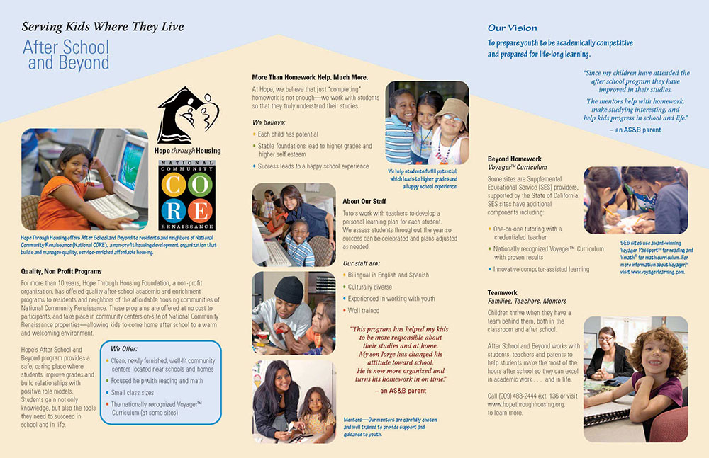
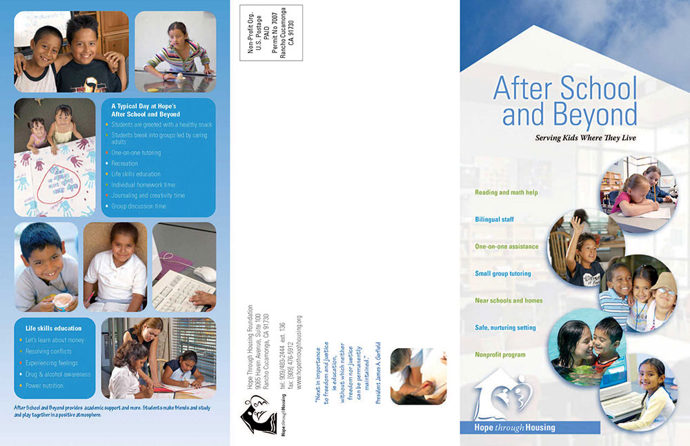
The inside background echoes the front design’s upward angle. I edited the text so it is concise and made easy-to-read bullet points. Because people often read captions first, information there also conveys our message. Cropping the photos with rounded corners gives the piece a fresher look. Pull quotes personalize the text. On the back, photos and bullets summarize a typical day at the site and the life skills learned.
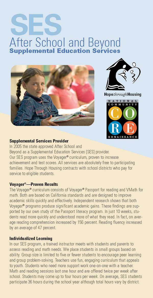
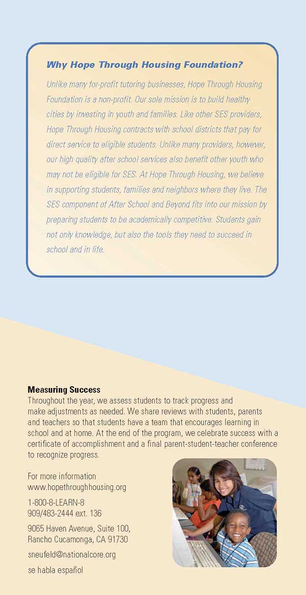
After School and Beyond is approved as an SES program, making it eligible for certain funding. As a supplement to the three-fold folder, we created a matching card with information specific to the SES elements. This card was designed to be slipped inside the brochure when it was handed out at certain events.

