Shirlee’s Ultimate Women’s Gym, Logo
When I designed the logo for this new women’s gym, I wanted it to look strong and feminine. I chose typestyles and …

When I designed the logo for this new women’s gym, I wanted it to look strong and feminine. I chose typestyles and …
Wavy text gives this logo for a water district’s anniversary the look of H2O. I choose a flowy, elegant serif font for …
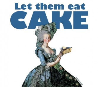
The queen of consumption, Marie Antoinette, epitomizes the few who are indifferent to the many—who better to represent the Occupy movement? I …
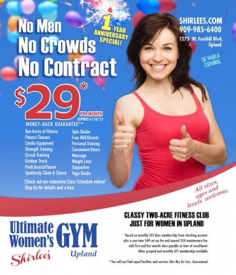
Balloons, a sparkler candle, and a big thumbs up lend a festive feel to Shirlee’s First Anniversary advertisement. Clean lines and good …
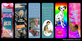
Custom bookmarks make a fabulous small gift. I use them as a substitute for greeting cards and gift tags. I designed a …
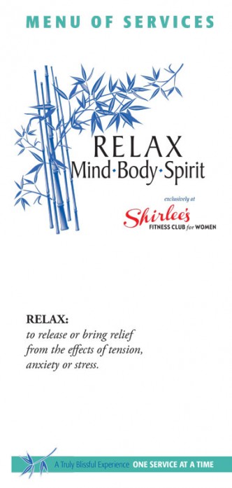
Elegant, professional, relaxing: that’s the feel I wanted for the logo for a spa at a woman’s gym. The owner wanted bamboo …
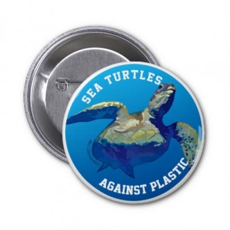
One image and just a few words can make a strong statement. To publicize the dangers of plastic bags and other items …
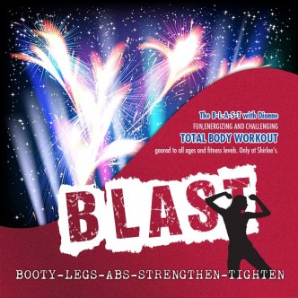
Exercise does not have to be boring. To drum up enthusiasm for a new class at Ultimate Women’s Gym, I used graphics …
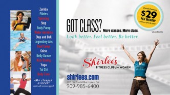
This direct mail postcard promoted the grand opening of a new gym, Shirlee’s Fitness Club for Women in Upland, CA. We wanted …
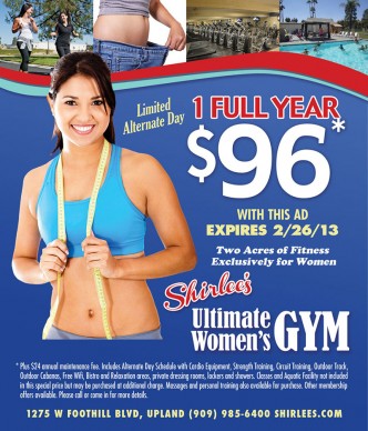
One look gives you the flavor of this business. When I designed the logo for this new women’s gym, I wanted it …