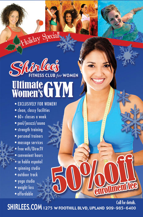
Shirlee’s Ultimate Women’s Gym, Advertisement
One look gives you the flavor of this business. When I designed the logo for this new women’s gym, I wanted it to look strong and feminine. I chose typestyles and colors that do both. “Shirlee’s” type has a retro feel and evokes a signature. “GYM” is larger so that whether you are reading an ad or a sign from the road you know right away that Shirlee’s is a gym (not a diner or anything else!) The type is strong, yet serif edges give it a feminine and classy touch. The red, white and blue colors are sporty and American. I purposefully avoided pink altogether. The women who worked at the gym loved Tiffany Blue, so we use a bit of that to soften things up. In this ad the waves of red and Tiffany blue give movement and suggest the kind of toned curves you will develop working out here. Images above show off the facility and the stock photos of the toned tummy and the beautiful woman show the goal you can reach. We tweaked this ad for the holiday season.


